


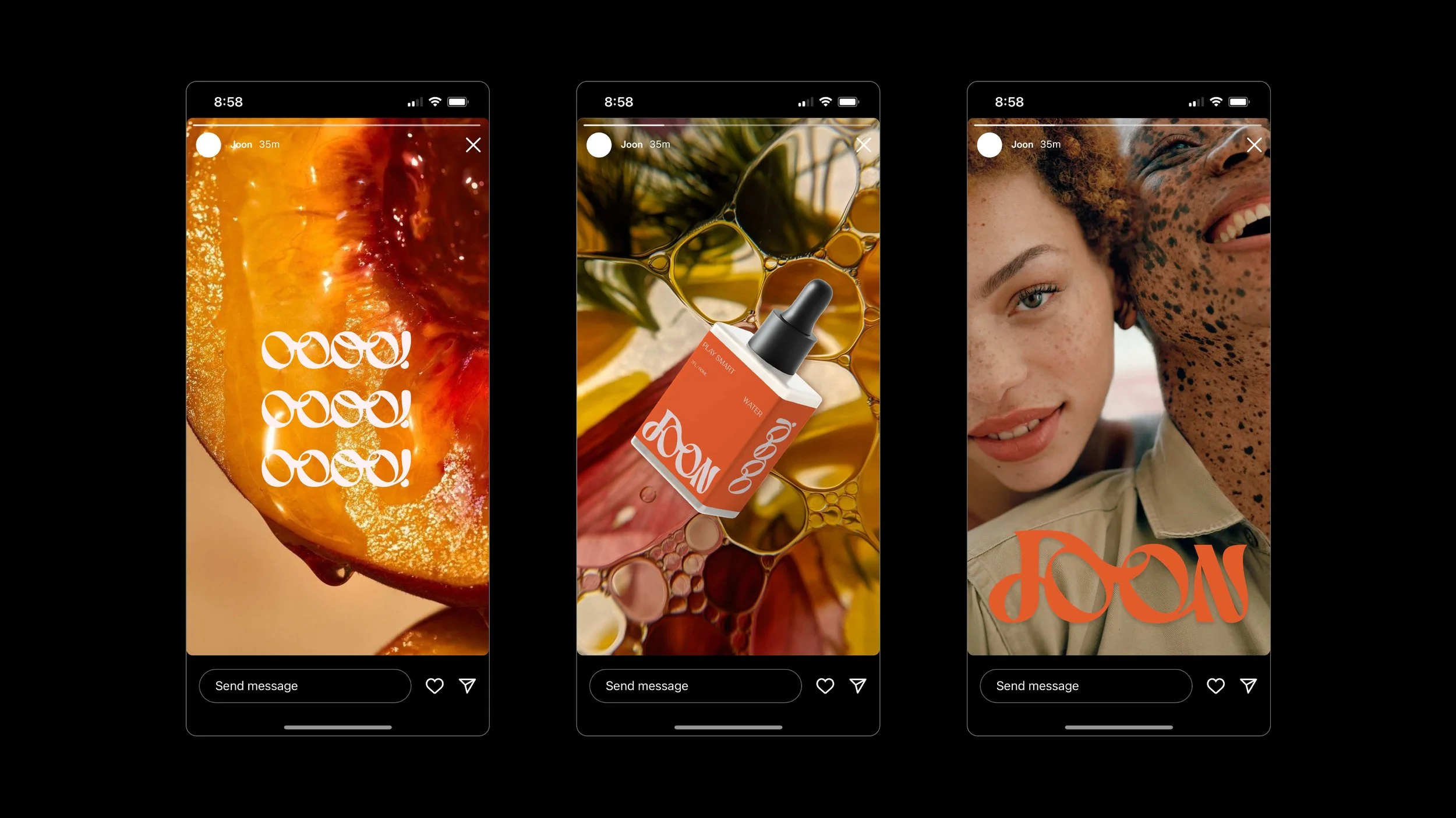
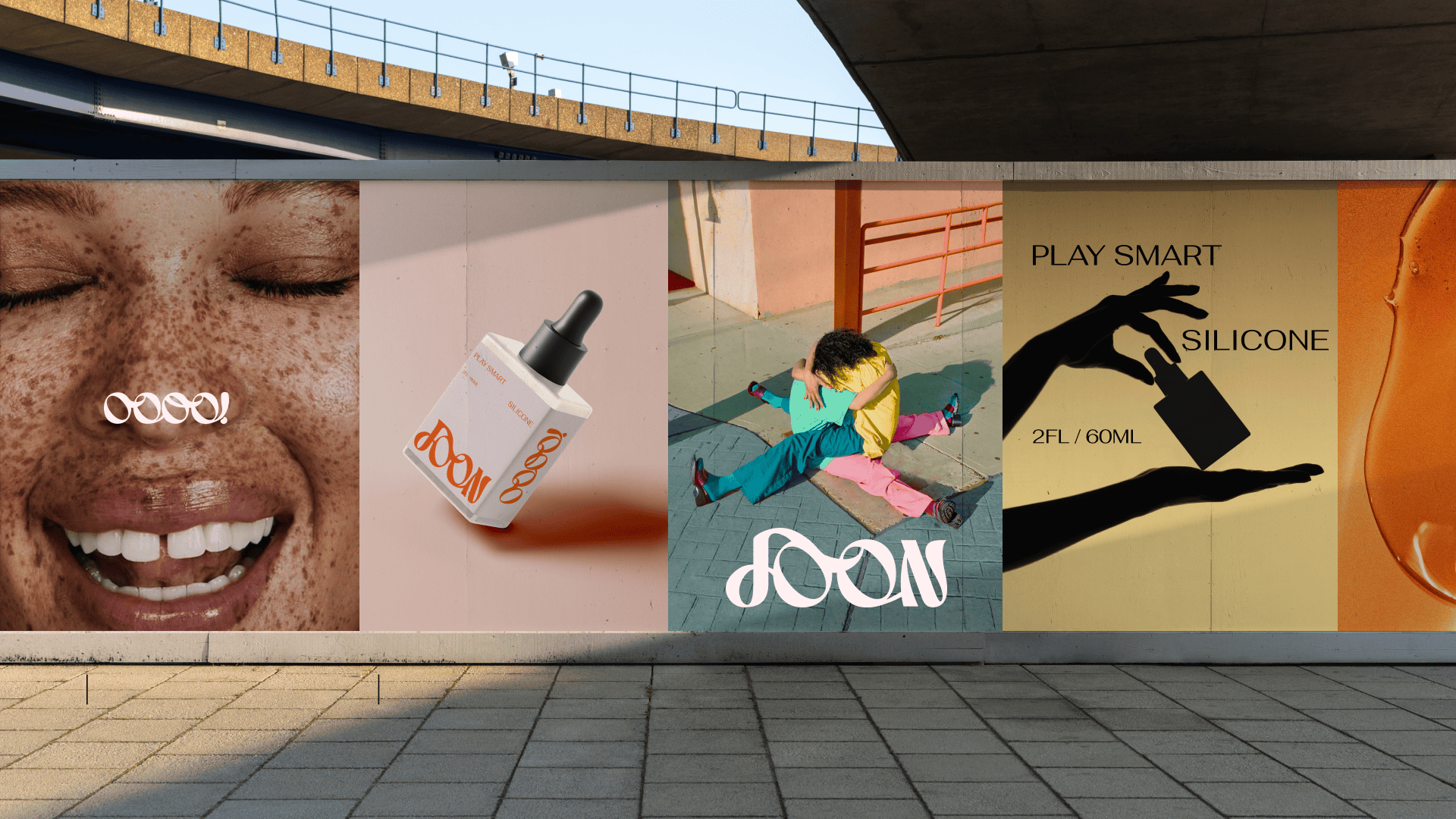


JOON / AURUM
UNLEASH THE SCIENCE OF SENSUALITY
Created @ Skidmore Studio
Founded to revolutionize intimate wellness, this brand blends the art of seduction with scientific innovation. Catering to luxury wellness shoppers, it redefines sexual health with sleek, sophisticated design and bold self-expression. Partnering with the client, our studio amplified their identity to resonate with modern consumers, celebrating the connection between pleasure, confidence, and well-being.
ROLES
BRAND IDENTITY, LOGO, PACKAGING
TEAM
CD: SHAWN MCCONNEL
DSGN: MARIANA RODRIGUEZ, TYLER DEHAUGE,
SARAH JOHNSON


STARBUCKS
BREWING MODERNITY WITH READY TO DRINK COLD BREW
Created @ Landor
Starbucks, a global icon renowned for its commitment to exceptional beverages, challenged us to reimagine the packaging for their Ready-to-Drink Cold Brew. The goal was to create a design that embodied energy, modernity, and craftsmanship while resonating with both loyal Starbucks enthusiasts and new consumers.
Our approach centered on crafting a packaging system that celebrated the refreshing nature of cold brew while staying true to Starbucks' premium brand image. The design featured a handcrafted pattern, reflecting the artisanal care behind each product, and a sophisticated color palette that infused the packaging with energy and vibrancy.
By balancing modern aesthetics with a handcrafted feel, the final design elevated the cold brew experience, positioning it as a premium offering in a competitive market. This project exemplified our ability to merge storytelling with strategy, creating a design that captures the essence of Starbucks Cold Brew while fostering a deeper connection with its audience.
ROLES
PACKAGING
TEAM
LANDOR CREATIVE


POLYFORM
COMPLETING THE CYCLE OF PLASTIC
Created @ Skidmore Studio
Reimagined through a collaboration with our creative studio, Polyform sought to redefine its role within Plastipak’s family of companies while elevating its independent identity. By aligning with the main brands mission of innovation and sustainability, Polyform embraced a bold rebrand focused on showcasing its value as a service provider and employer. Through thoughtful design and strategic messaging, we highlighted its commitment to turning discarded plastic into valuable resources, positioning Polyform as a leader in the recycling world. The refreshed identity emphasizes modern sophistication, innovative solutions, and a clear connection to sustainability.
ROLES
BRAND IDENTITY, LOGO, WEBSITE
TEAM
CD: SHAWN MCCONNEL
DSGN: MARIANA RODRIGUEZ, SARAH JOHNSON


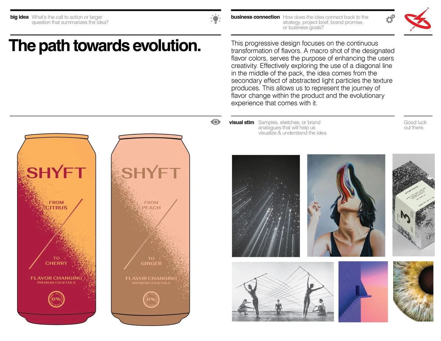


SHYFT
FLAVOR CHANGING COCKTAIL EXPERIENCE
Created @ Soulsight
Launched by Constellation Brands, Shyft is a groundbreaking flavor-changing cocktail designed to captivate modern consumers. Tasked with building a brand that embodies transformation, our creative team developed a dynamic identity that highlights the innovation and uniqueness of Shyft. Through a year-long collaborative process, we crafted a visually compelling brand rooted in clean, modern aesthetics. We positioned Shyft as a standout in the beverage industry.
ROLES
BRAND IDENTITY, LOGO, PACKAGING
TEAM
CD: MICHAEL SHELTON
DSGN: MARIANA RODRIGUEZ, AMANDA JACKSON


FEBREZE
ELEVATING FRESHNESS: REVITALIZING THE FEBREZE AIR / MIST COLLECTION
Created @ Landor
As part of a broader brand refresh, we partnered with Febreze to reimagine the Air/Mist Collection packaging, focusing on creating an immersive, sensorial journey while maintaining the premium quality the brand is known for. Through meticulous design revisions and collaboration, we developed packaging that evokes emotions of comfort and freshness, inviting consumers to feel uplifted in their environments. Thoughtfully crafted imagery, soothing color palettes, and refined typography work together to convey luxury and sophistication, while reinforcing Febreze’s mission to bring tranquility and rejuvenation into everyday spaces.
ROLES
CAMPAIGN, PACKAGING
TEAM
LANDOR CREATIVE


FREELANCE
EDITORIAL EXPLORATION: FROM CLARENDON’S HISTORY TO STUDIO INNOVATION
Created for freelance
This editorial project explored the rich history and timeless appeal of the typeface Clarendon through the design of a visually engaging book. From its origins in 19th-century England to its enduring influence in modern design, the book highlights Clarendon’s evolution and significance across industries. The editorial layout blends historical depth with contemporary styling, featuring refined typography, dynamic layouts, and curated visuals that honor the typeface's versatility.
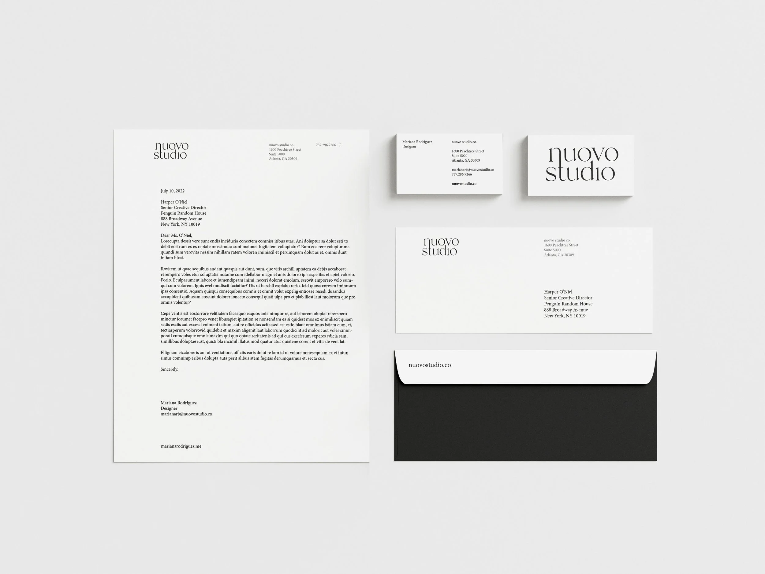
In addition, I’ve collaborated with Nuovo Studio on editorial designs, showcasing my ability to craft compelling layouts that balance storytelling with aesthetic impact. Whether diving into the intricacies of type history or designing for modern brands, these projects reflect my passion for editorial design and my commitment to creating work that informs and inspires. Editorial Exploration: From Clarendon’s Heritage to Studio Innovation
ROLES
EDITORIAL
TEAM
MARIANA RODRIGUEZ